It’s not often that I look back at work from a couple of years ago and am still happy with the design, etc. This HeadingTwo brand is one of the exceptions! You might call it laziness, but I think we created a really nice brand style and never really got a chance to show it off!
Choosing a Logo
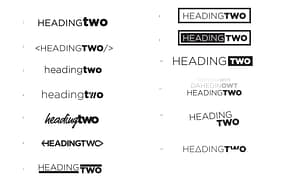
The logo might have been the hardest part of the whole process – which I supposed isn’t that uncommon. TJ and I both went to the drawing board to come up with some examples of what we thought would suit the brand. Here are some of the concepts we originally started with, knowing that we wanted it to represent us both while speaking directly to designers and developers:

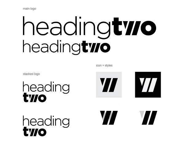
As you can see, many of them are similar in idea and, in the end, we went with a combination of ideas that was simple, clean, flexible, and timeless.

Choosing Colors
From the very beginning of our friendship, I’ve always known that TJ’s favorite color scheme was red and black. It’s also not a color combination I’d gotten to work with much, so we decided very quickly that we wanted to go that direction. I picked a semi-neon red color and, after TJ approved as well, I plugged that into a color palette generator and fine-tuned it from there. It’s mostly red, black, and grey, but we do have an accent cyan as well!

With colors chosen, we applied them to the logos to get what is now the current brand.

Designing the Peripherals
This is the fun stuff! We’ve got some other things planned for the future, but here’s a quick teaser….


